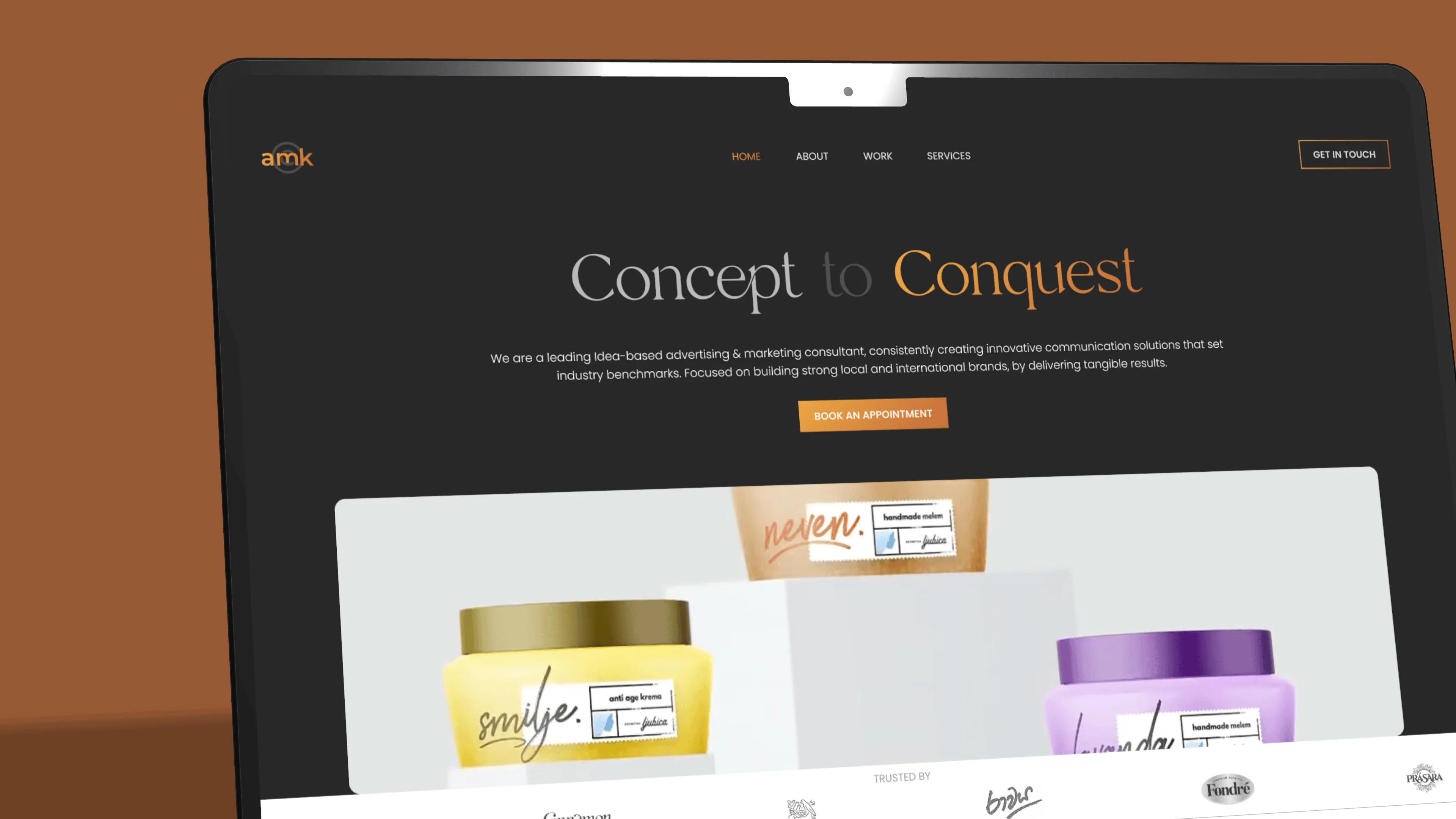
A redesigned website for a marketing consultant, with a modern layout and refreshed visual identity, so visitors can easily find and understand their services.
Role
UI/UX Designer
Duration
2 months
Platform
Mobile and web
TL;DR
Problem
An outdated design and a structure that didn't highlight the consultant's services.
Solution
A modern, intuitive layout that aligns with the brand, with a streamlined user journey and a refreshed visual identity.
Design process
Research & analysis
Three problems with the existing site
Cluttered Layout
Information is presented in a disorganized and cluttered manner, overwhelming users and making it hard to focus on key content.
Inconsistent User Experience
The user experience varies across different pages, leading to a lack of cohesion and confusion for users.
Outdated Visual Design
The current design feels outdated and does not align with modern web design standards, potentially harming the brand's image.
Structure
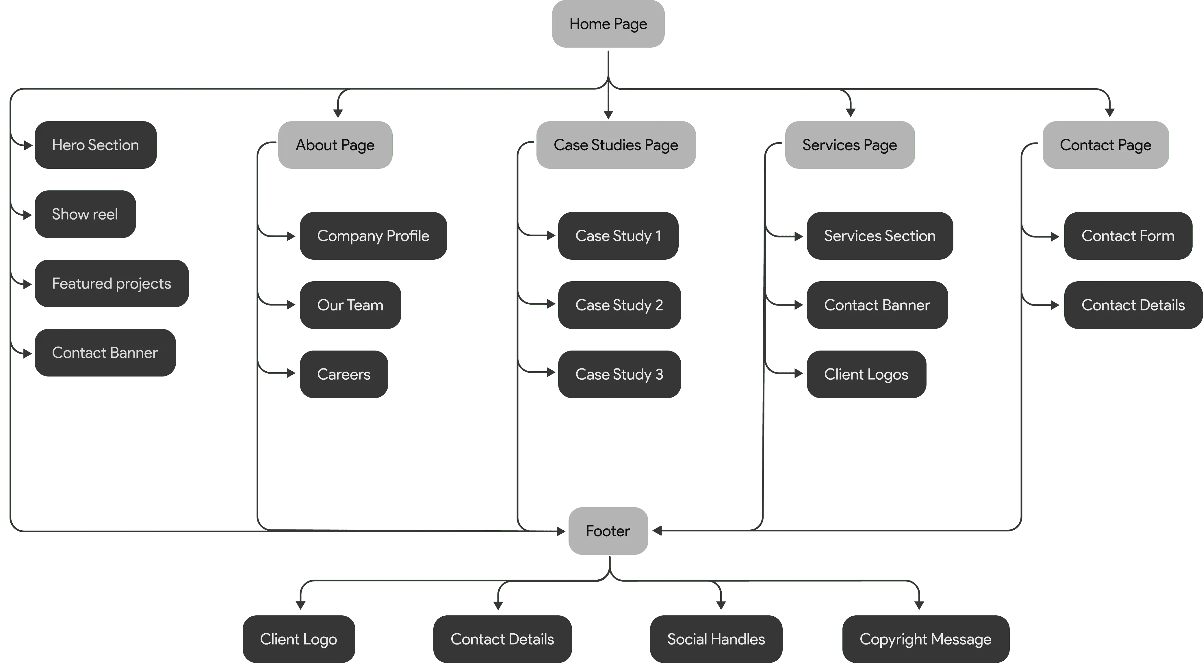
Information architecture
Wireframes
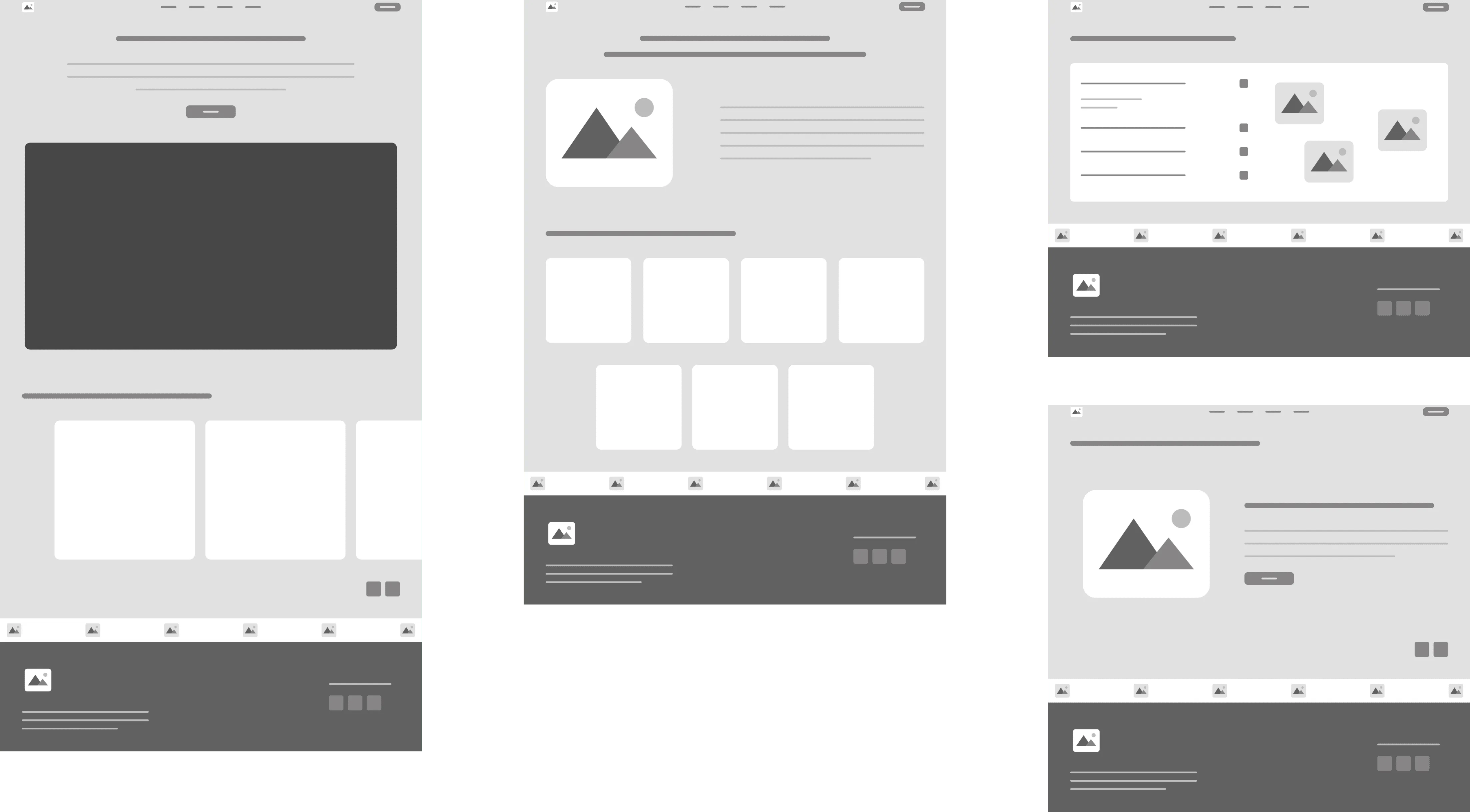
Structure and layout before visual design
The wireframes provide a clear guide for the structure and layout with the help of the Information Architecture, ensuring a focus on usability and content placement before final design elements are applied.
Balancing Tradition and Innovation
Visual design
Since AM Kreations is an established marketing consultancy in Sri Lanka, the redesign aimed to maintain the brand's core identity while modernizing its visual appeal and enhancing user experience. The goal was to preserve the brand’s essence while ensuring the new design reflects contemporary trends and functionality.
Prototype
The redesigned site in use
A walkthrough of the redesigned site, from the home page through the rest of the structure.
Before & after
Logo
A refreshed logo
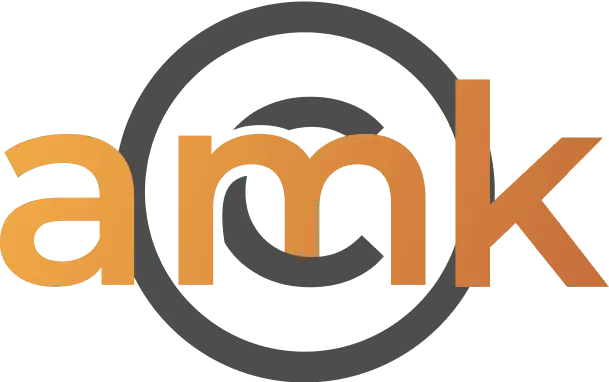
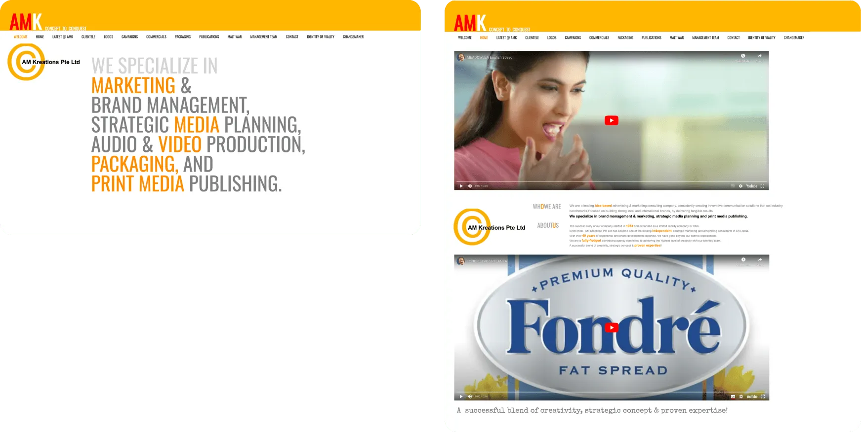
The old logo was a low-resolution image of the company name over a yellow circle. It was replaced with a simple “amk” monogram in the copper gradient used across the new site, keeping a warm tone while moving to a cleaner mark.
Before
After
Navigation
A more intuitive navigation system
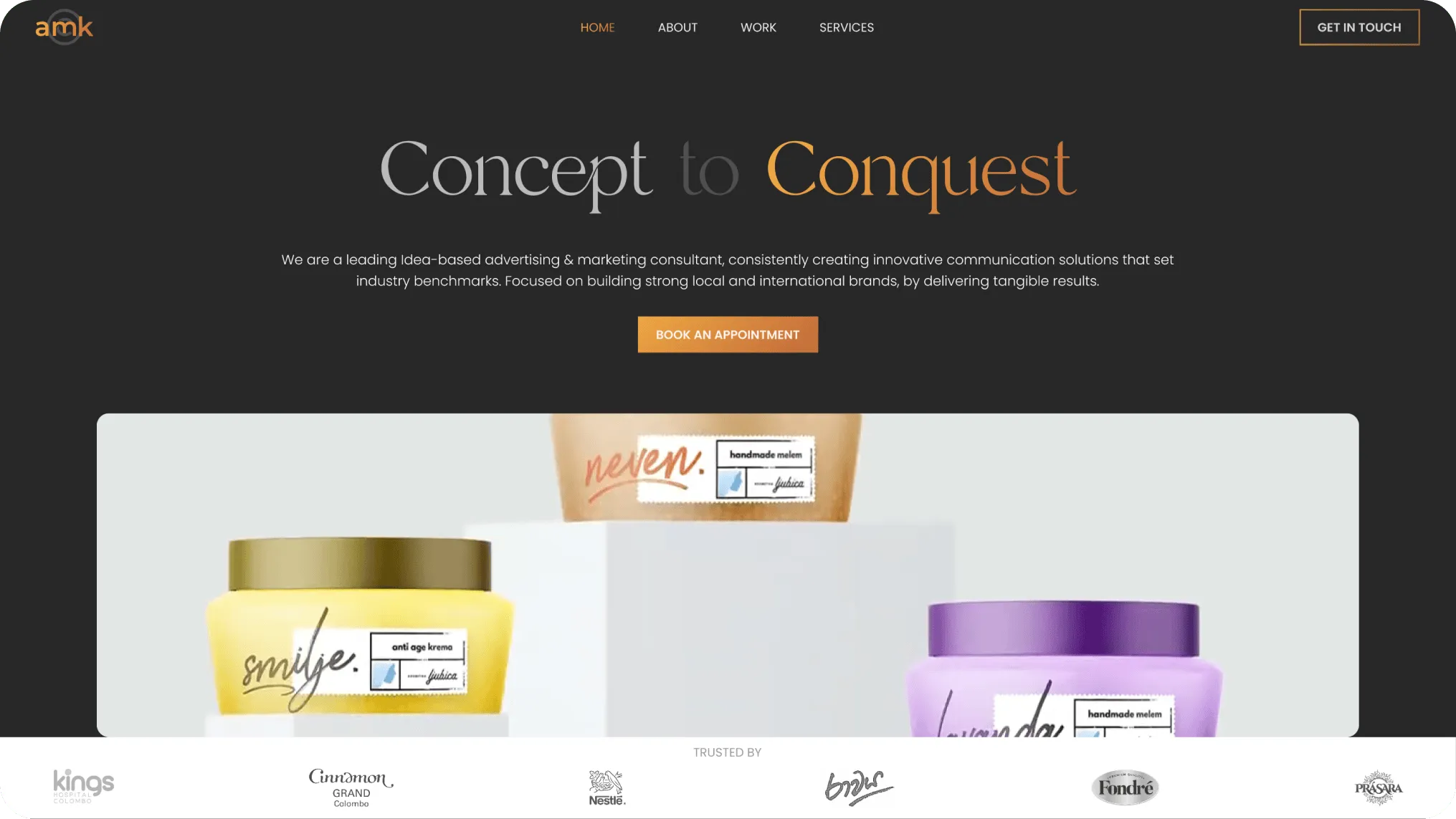
The navigation was unstructured, so a more intuitive and user-friendly navigation system was proposed using a well-thought-out information architecture, alternating between the light and dark theme.
Before
After
Home page
Welcome and home pages merged into one
Initially, the website had separate welcome and home pages, which caused confusion for users. In the redesign, these were merged into a single, streamlined page for clarity
Before
After
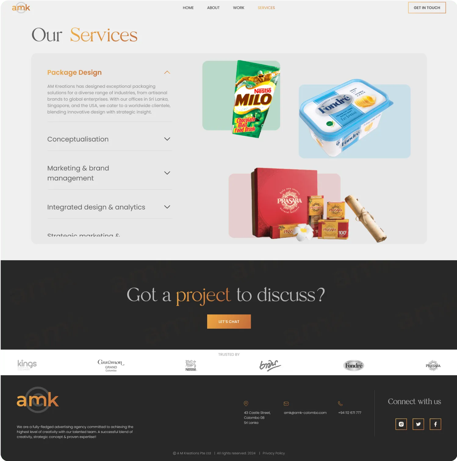
Services page
Services consolidated into one page
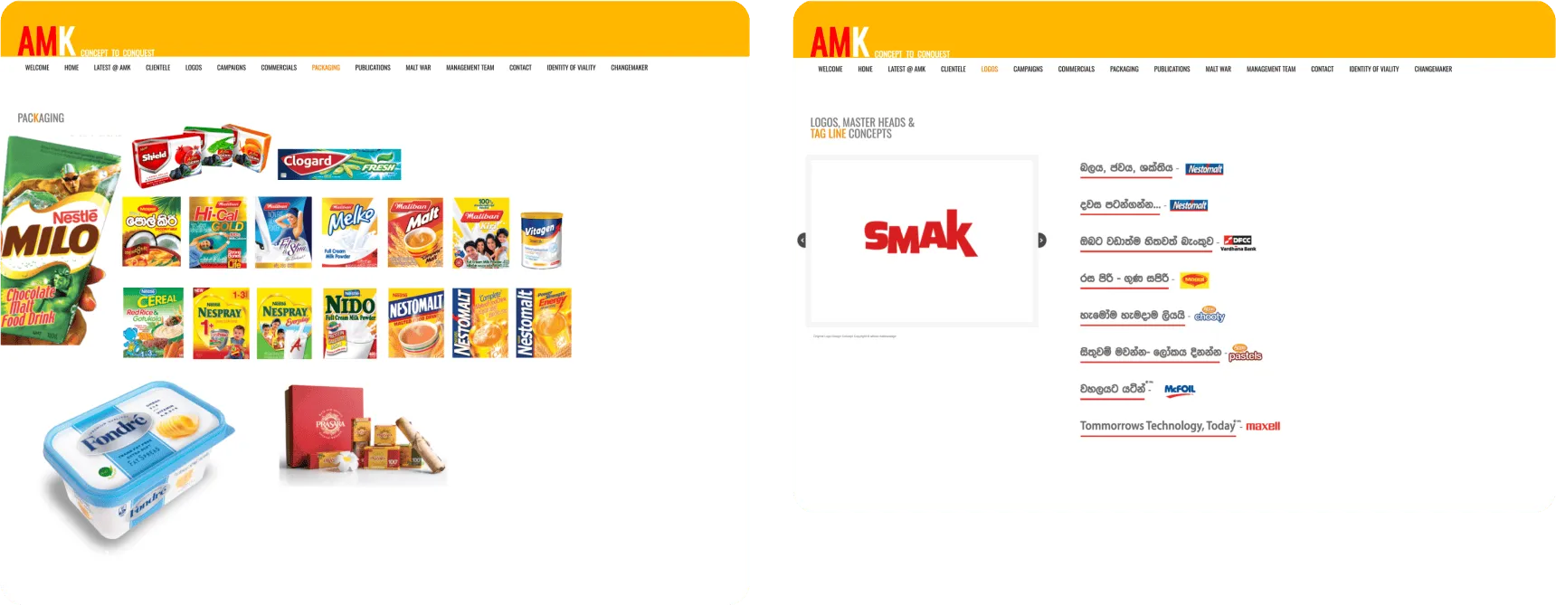
Previously, services were spread across multiple pages, making it difficult to get a quick overview. We’ve simplified this by consolidating everything into one concise page. This update provides a brief description of each service along with examples of the work, offering a clear and streamlined view of our offerings.